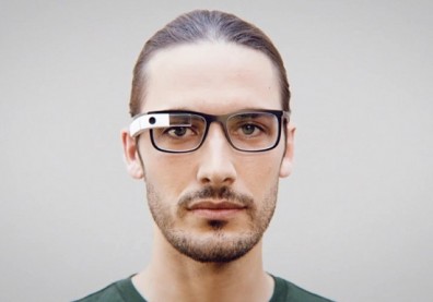
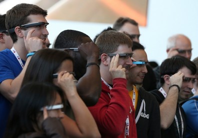
So, you've seen Google Glass, and your first reaction was, "What kind of doofus would wear that?"
That makes you like roughly 90 percent of the population (although I'm still pining for one despite it being weird looking, for some reason), so no worries. But compared to what Glass used to look like the current version looks like it was designed by Alexander McQueen.
Over at Business Insider, they give a look at what Glass looked like just three short years ago, and man, it had no alibi. It was ugly. The above picture was shown by Google's Janine Gianfredi at a ThinkLA event last week to prove a point that Glass could be way worse.
If you're not thrilled with the Glass Explorer Edition either, just keep in mind that a little patience could go a long way with Glass in the style department. Google might not have the perfect stylish vision on their own, but help is on the way from glasses champs Ray-Ban and Oakley.
As our own Matt Buzzi reported a few days ago, "Google tells us not to expect Glass combined with your favorite brand right away, but that the partnership 'marks the start of a new chapter in Glass's design.'"
So in other words, be patient, and be happy that you weren't the guy who had to look like a huge doofus wearing that original Glass prototype.


