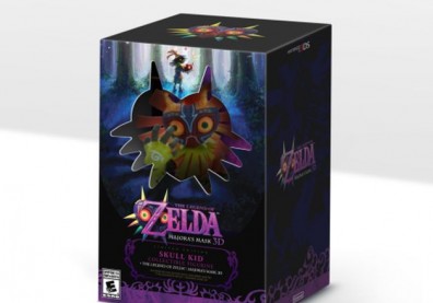
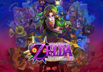
The official announcement of the much-desired Majora's Mask 3DS remake swept the internet this week, with a debut trailer exciting fans of the original N64 title.
Majora's Mask For 3DS Announced
The remake seems impressive, but many might not remember exactly how the original looked. A side by side comparison trailer from YouTube user Nintend2tv, below, shows off the differences between the same scenes in each Majora's Mask game.
The 3DS version looked good on its own, but putting them alongside each other makes it obvious how much the game has improved. The characters in particular are much more detailed and move with more lifelike animations than before, as you can see at various points. The effects and colors have also changed, and there's generally more happening in the 3DS scenes.
Super Smash Bros Pilot Wings Wuhu Island Stage For Wii U Revealed
I will say that I'm not sure I like the changes to the moon's face, but that might just be my nostalgia talking. The game definitively looks better, even if we can only compare the relatively small sample of clips from the first trailer at this time. Perhaps some new gameplay additions and features will be announced, as well, but right now it just looks like a straight port with a graphical face lift. For fans of the original (and for what it's worth, Majora's Mask is my favorite Zelda title), that's not such a bad thing.


